Hi Everyone,
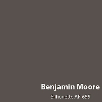
Below is Benjamin Moore’s Color of the Year (COTY) 2026.
Well, what do you think, Laurel?
It kind of reminds me of sewer sludge.
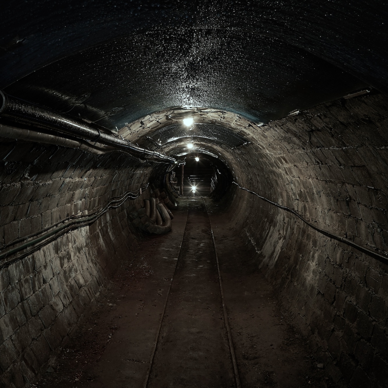
Photo by Martin Brechtl on Unsplash
Hehe, I knew you wouldn’t disappoint. Please, don’t stop now.
Of course not.
Indeed, the Benjamin Moore COTY 2026 Silhouette looks like sewer sludge.
Alright, Laurel. Let ‘er rip!
Well, I’m afraid you might be disappointed.
All images not otherwise specified are from the Benjamin Moore Website.
You see… Sewer sludge is a fantastic wall color.
I’ll let you chew on that for a sec.
Okay, Laurel. Why is it a fantastic wall color?
I’m getting to that, please be patient. ;]
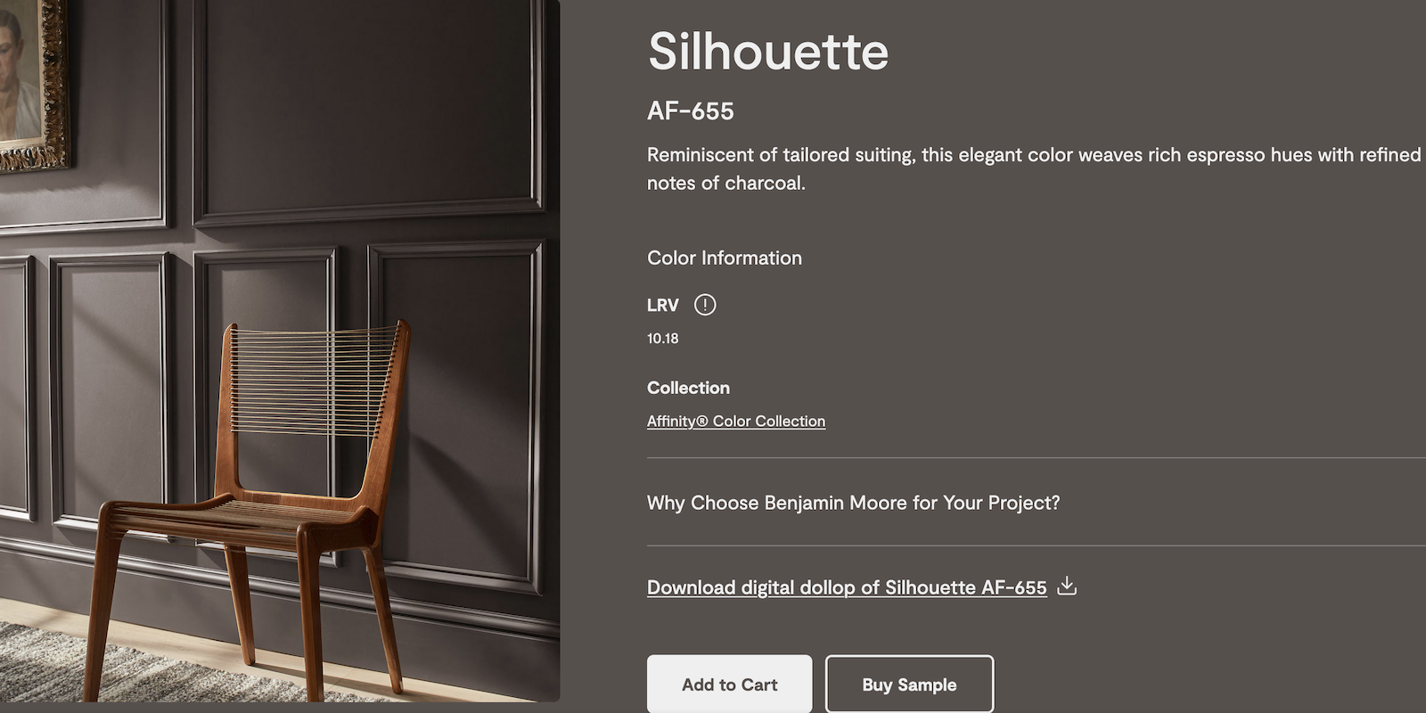
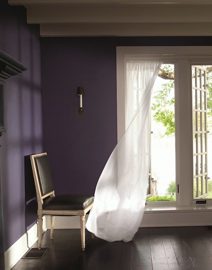
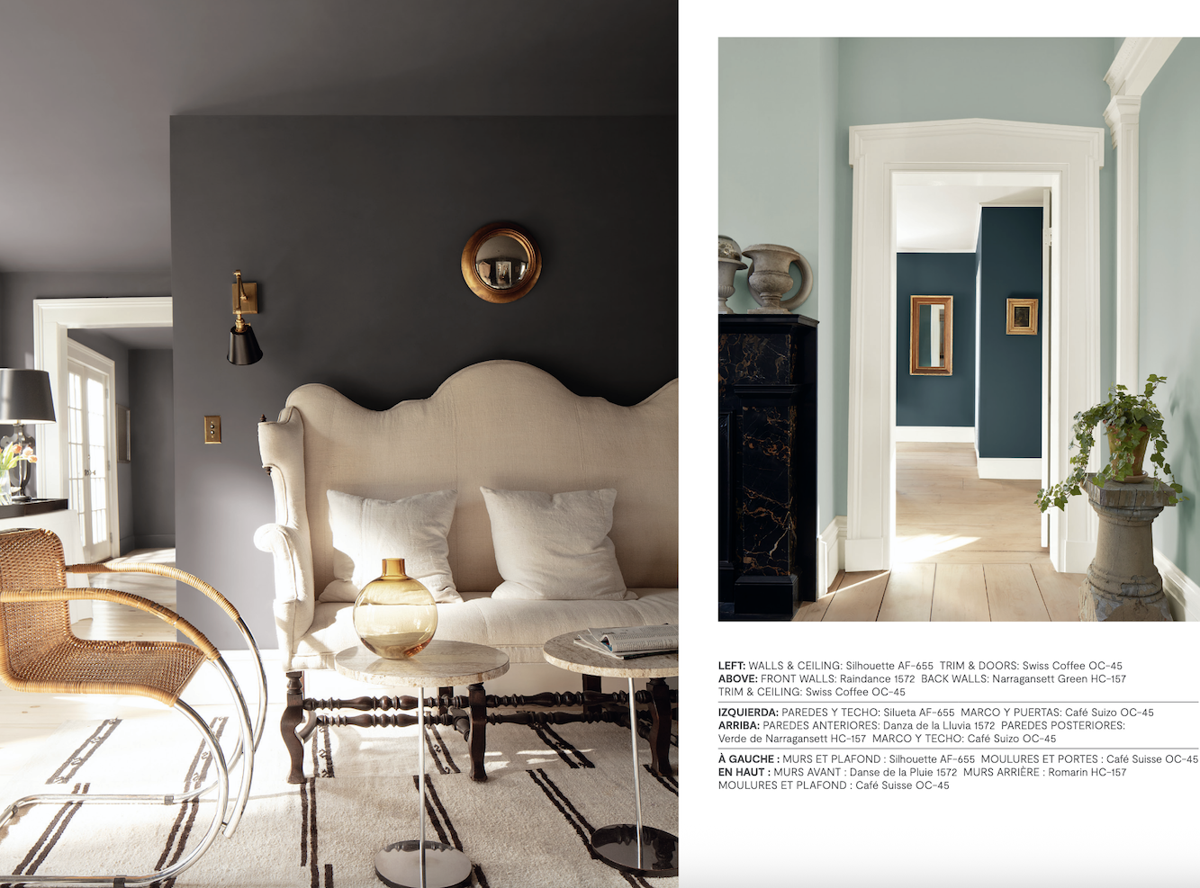
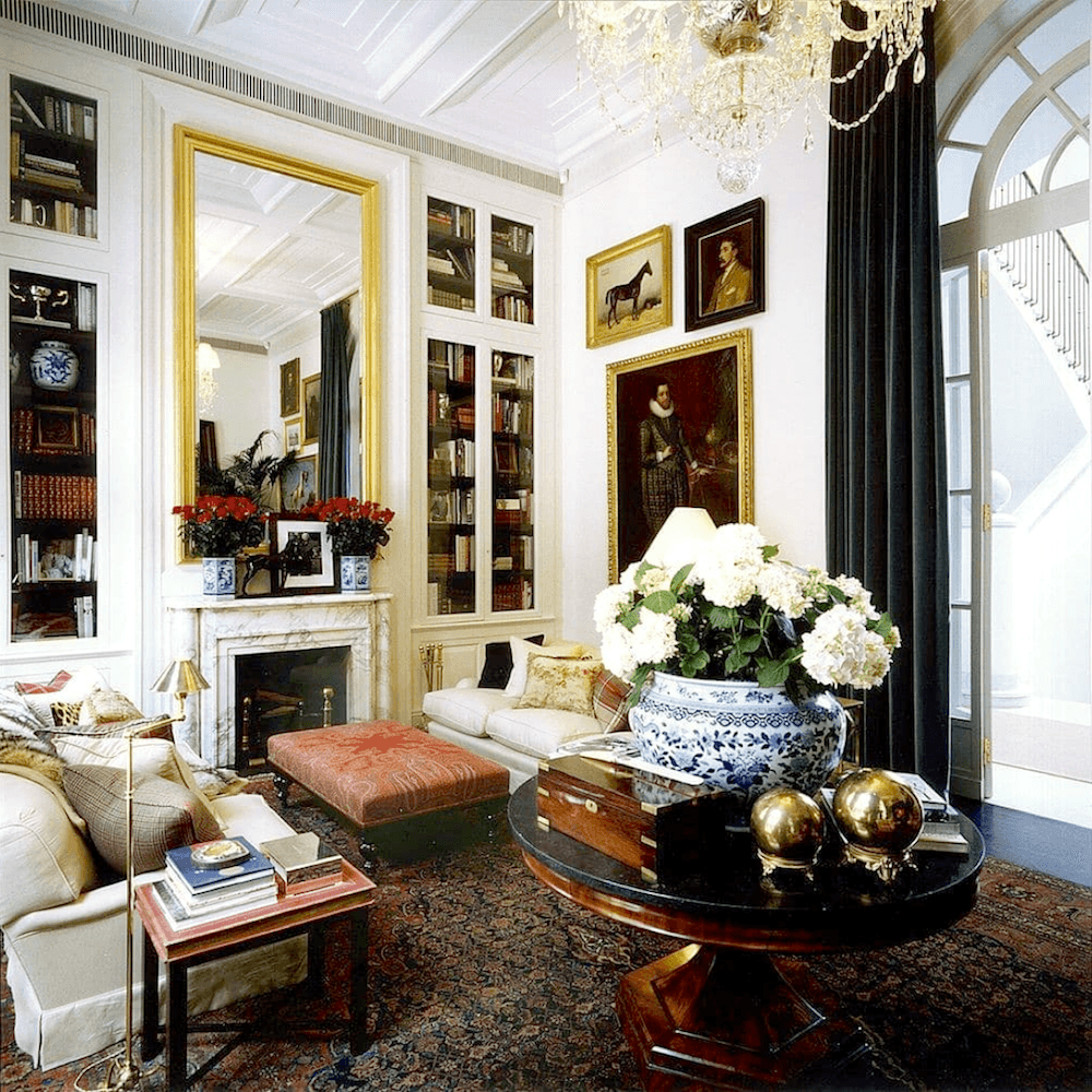
It’s a wonderful wall color because it’s neutral, yet saturated, and darkly enigmatic. This color makes a fantastic backdrop for art. It can go super contemporary or very traditional.
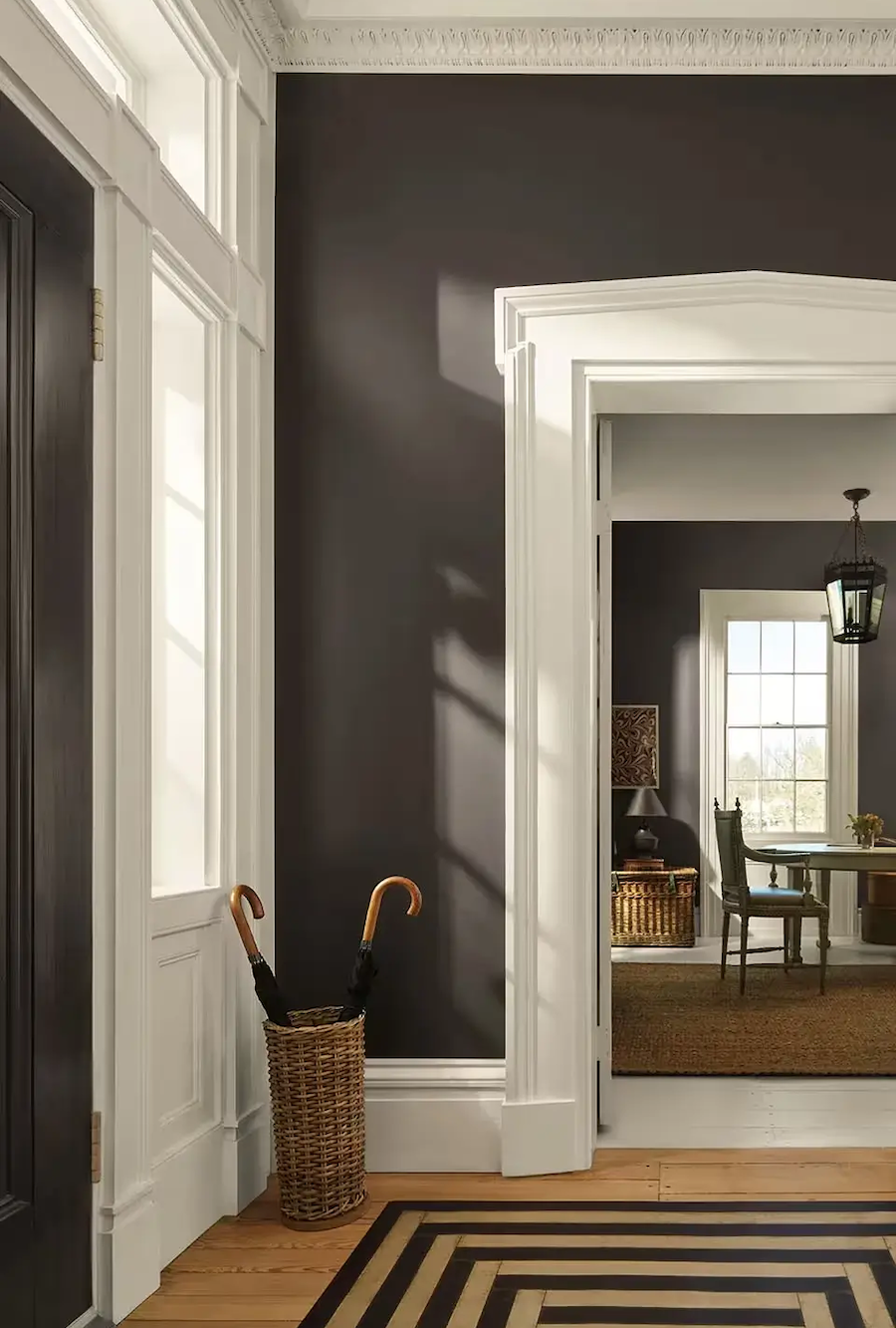
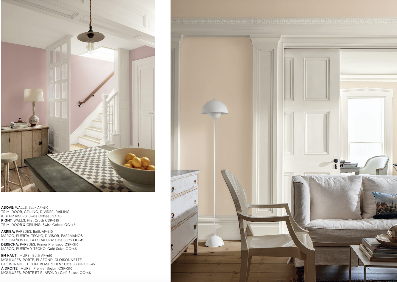
Above, creamy Swiss Coffee is a beautiful complement to Silhouette in this Greek Revival-style home.
Well, might it make a room look like a cave?
It might. But let’s back up a sec and discuss this color more in depth.
Another reason it’s a wonderful color is that it’s difficult to tell what color it is.
Is it brown?
Almost.
Is it charcoal gray?
Close.
Well, sometimes it will look brown, or it could also look charcoal gray. I don’t think it will ever look like a pure black.
The most prevalent undertone is purple. However, it’s a very subtle purple; much more subtle than the COTY 2017 – Shadow.
Shadow is one shade deeper than the original color of my Bronxville bedroom, which was Tropical Dusk.
What happened was the bedroom was indigo and had oxidized, and wasn’t to my liking.
Except at night. I liked it at night.
I tried samples of at least a dozen colors. And the funny thing is that at night they all looked pretty much the same. I didn’t hate this color, but probably would’ve liked Silhouette better. I lived with it for about five years, and then it changed to this.
Before the paper went up, the entire room was painted Benjamin Moore White Dove. And I have to say, I loved it so much, I felt a bit bad about the wallpaper. However, I was gifted the paper, and it was sitting in my entry waiting to go on the walls. Of course, I loved this too.
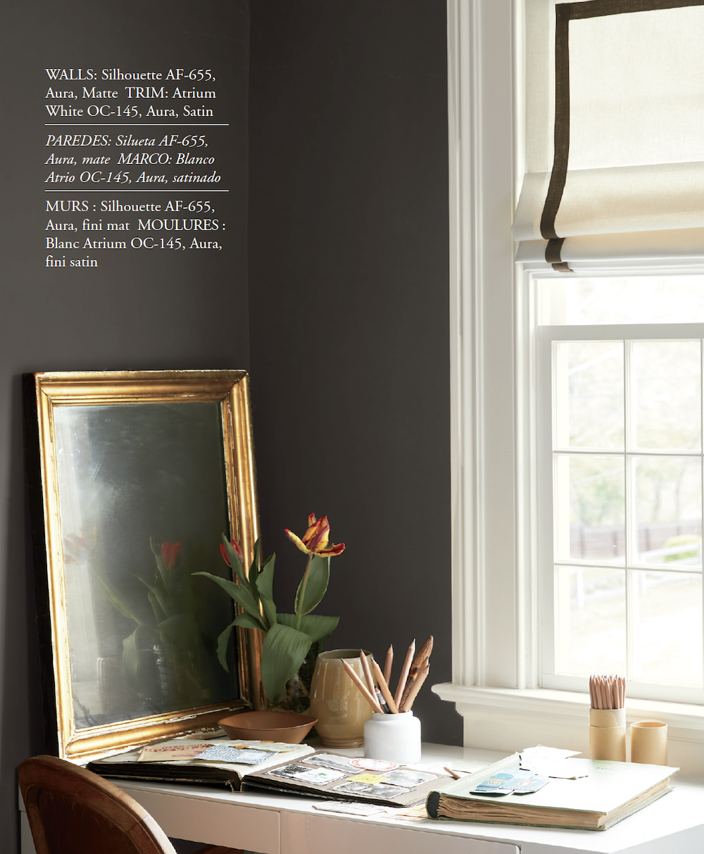
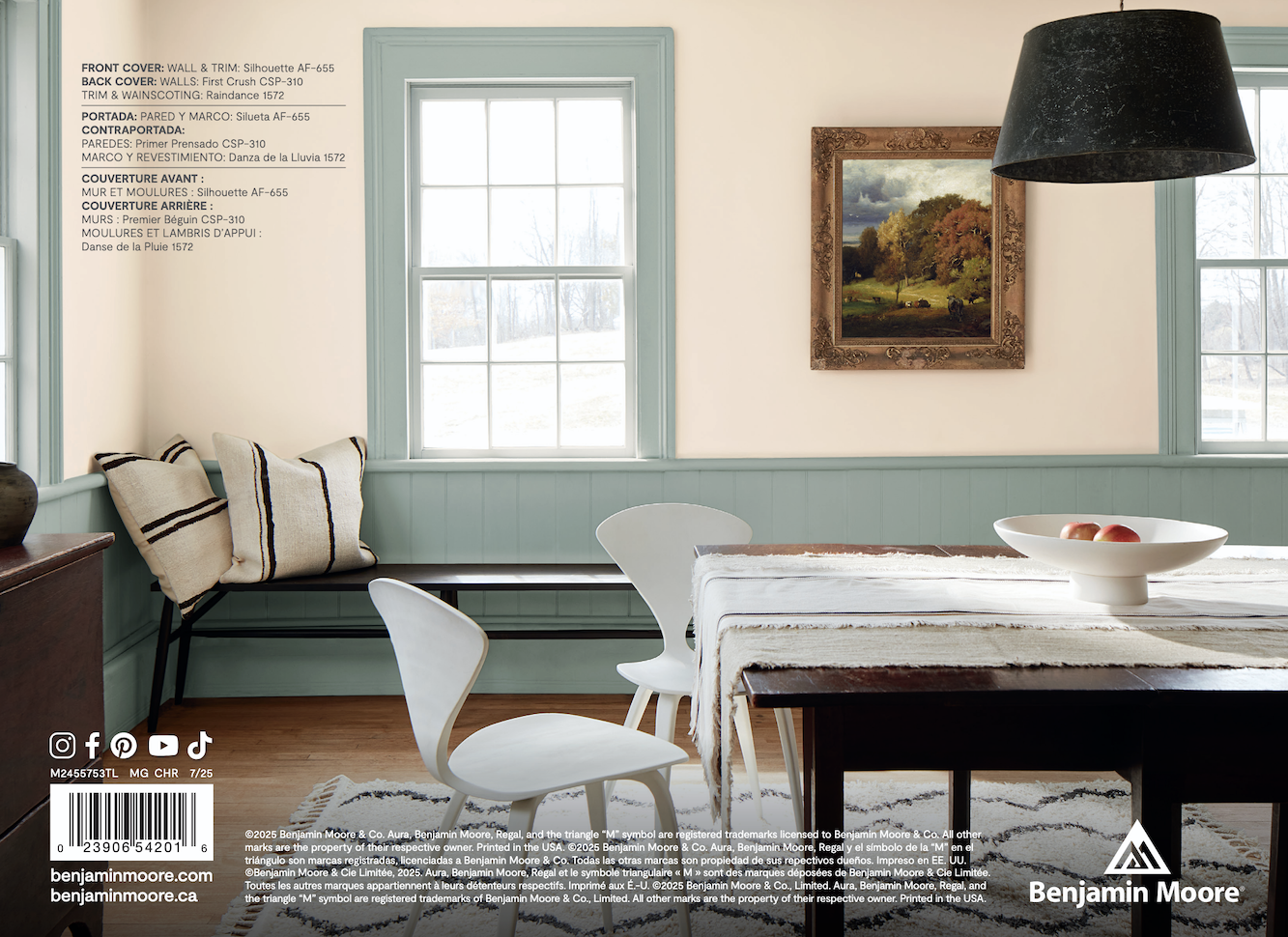
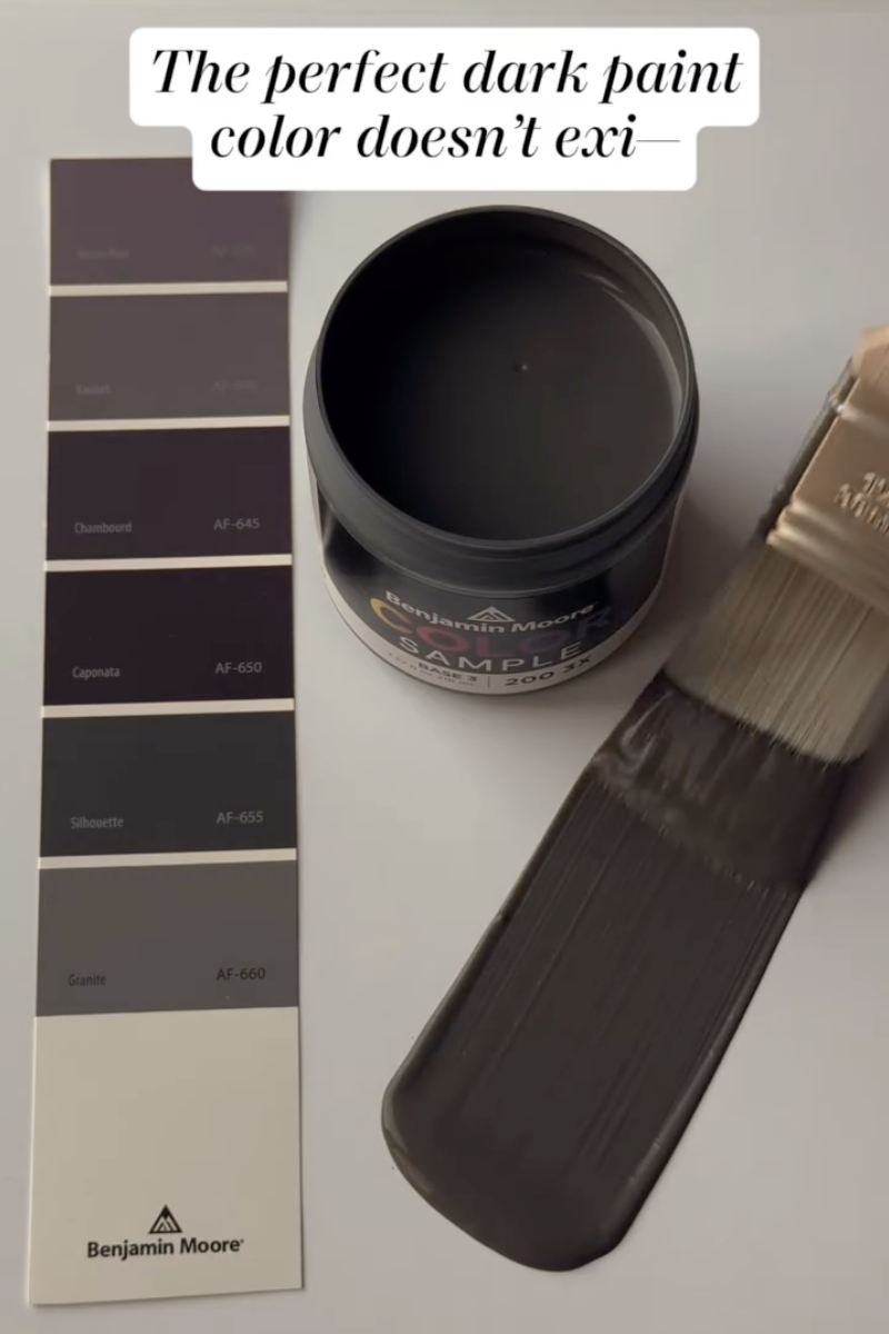
Okay, one more image of Benjamin Moore COTY 2026 Silhouette af-655.
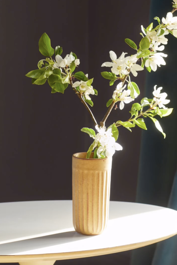
The green of the leaves brings out the purple undertone of Silhouette.
So, I do like this color. In fact, it’s the best color they’ve had since Simply White in 2016.
I’m hearing a “but,” Laurel.
This time you’re right.
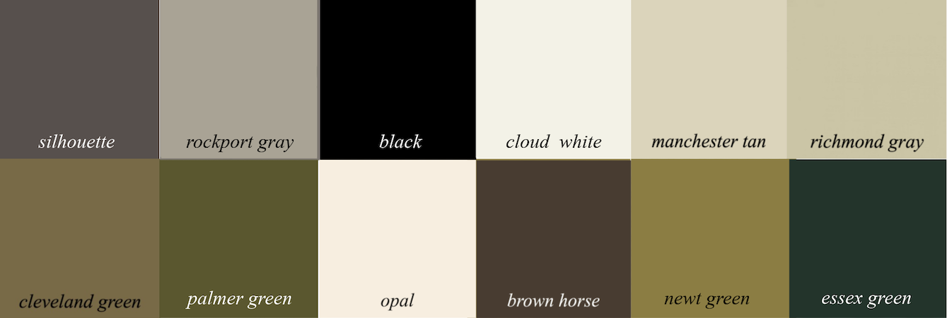
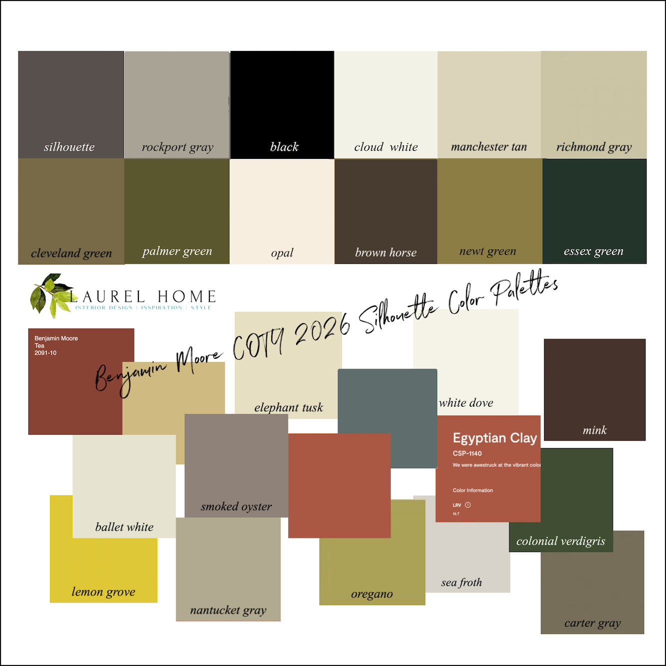
The thing I’m having a problem with is that some of the other colors they’re pairing Silhouette with as a palette.
Below are the colors.
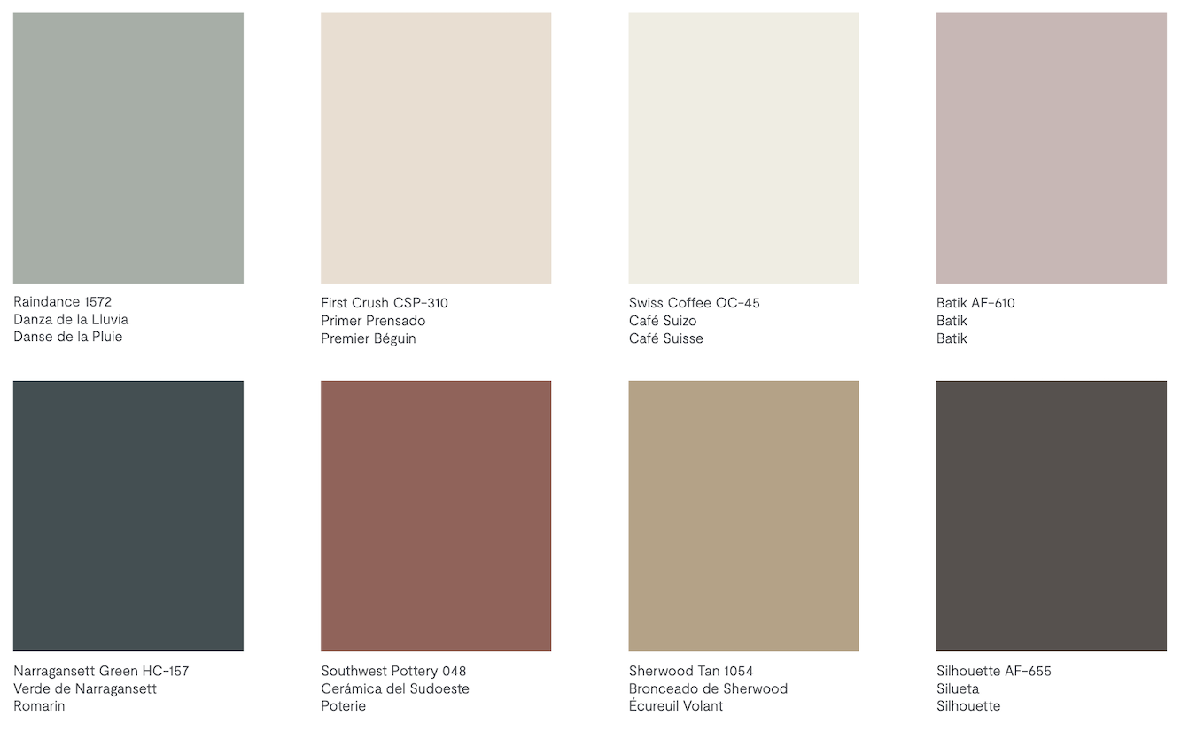
This looks like a corporate color scheme.
I don’t know what corporation, but this color scheme is not anything I would use for someone’s home. Like, you could take the bottom three colors to the left of Silhouette, and those could be the foundation for a good color scheme.
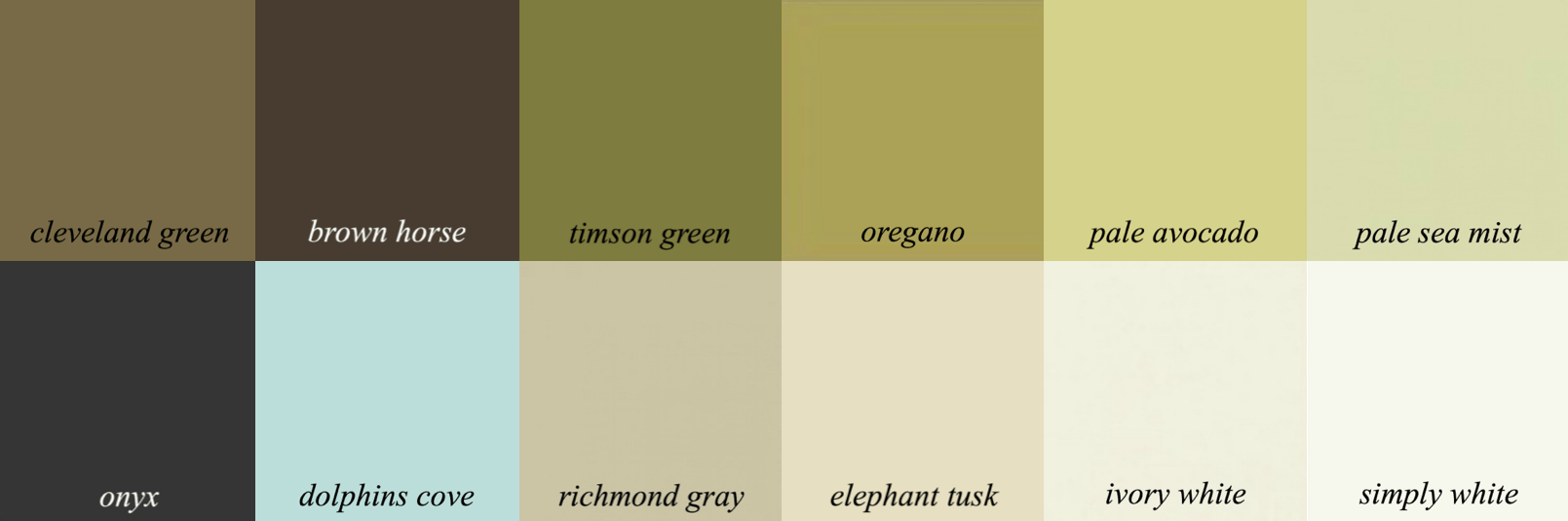
Below is another color card from 2021. Silhouette is part of this palette, too.
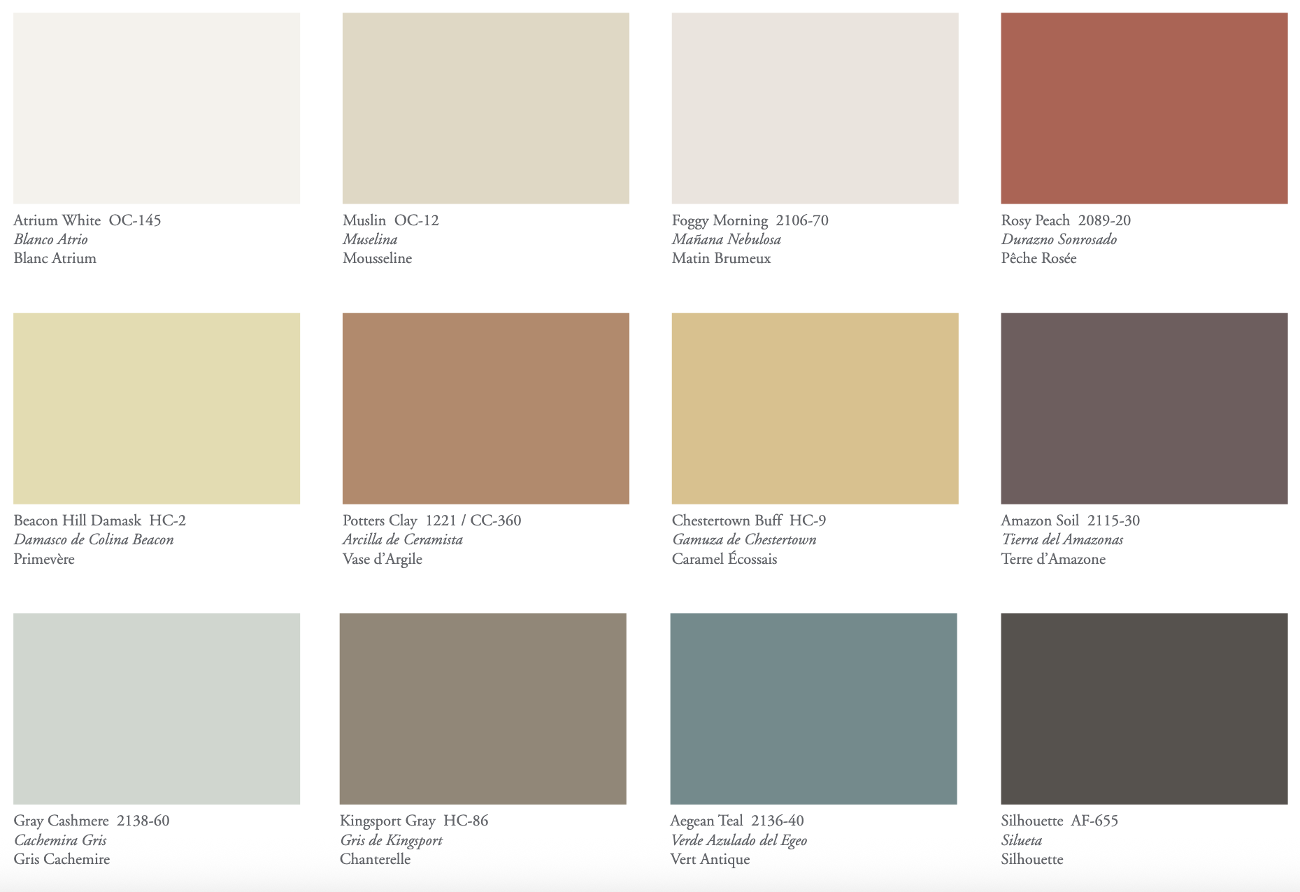
It’s a bit better than the palette for 2026. However, I feel it’s too many clashing colors.
Then there are these combos for this year.
I would not put these colors near each other. It’s one or the other.
However, the one below is worse.
And then there’s this duo, below:
Pepto Bismol and peach. I don’t mind the colors on the right, but why are they putting these colors together?
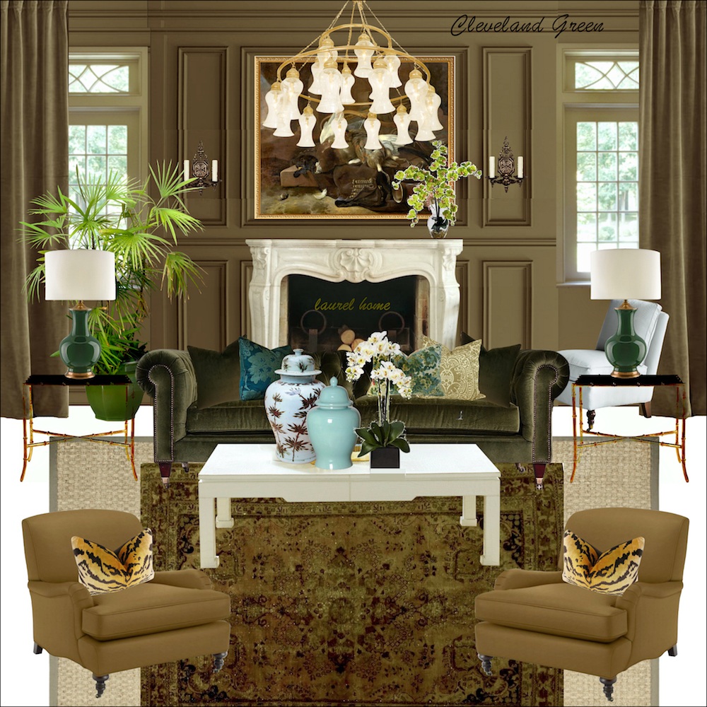
Below is a palette I came up with.
This is a sophisticated, earthy palette. Some won’t care for it, but a palette like this needs lots of white.
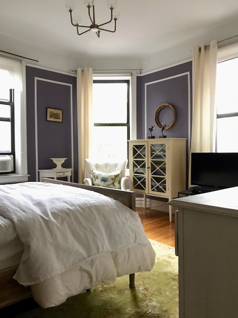
Let’s bring back the Greek Revival room, and then I think it’ll make more sense.
Below is a similar palette from the Laurel Home Paint and Palette Collection.
Below is the mood board that goes with this palette.
I also made a board with some of the rejects. Some might like it better because it has more color.
All of the colors together remind me of Ralph Lauren’s style.
Silhouette is a fine color, but an attractive palette would have variations of this color and then accents of some of the colors you see above.
Please note that color palettes include colors that might not be on the walls but in the room’s furnishings.
One thing to remember that we’ve discussed before is that dark colors like Silhouette are better for smaller rooms, not more than 200 square feet.
What do you think of Silhouette? I know some will like it and some won’t, solely because they’re not a fan of dark colors.
xo,

***Please check out the recently updated HOT SALES!
There is now an Amazon link on my home page and below. Thank you for the suggestion!
Please note that I have decided not to create a membership site. However, this website is very expensive to run. To provide this content, I rely on you, the kind readers of my blog, to use my affiliate links whenever possible for items you need and want. There is no extra charge to you. The vendor you’re purchasing from pays me a small commission.

To facilitate this, some readers have asked me to put
A link to Amazon.com is on my home page.
Please click the link before items go into your shopping cart. Some people save their purchases in their “save for later folder.” Then, if you remember, please come back and click my Amazon link, and then you’re free to place your orders. While most vendor links have a cookie that lasts a while, Amazon’s cookies only last up to 24 hours.
Thank you so much!
I very much appreciate your help and support!
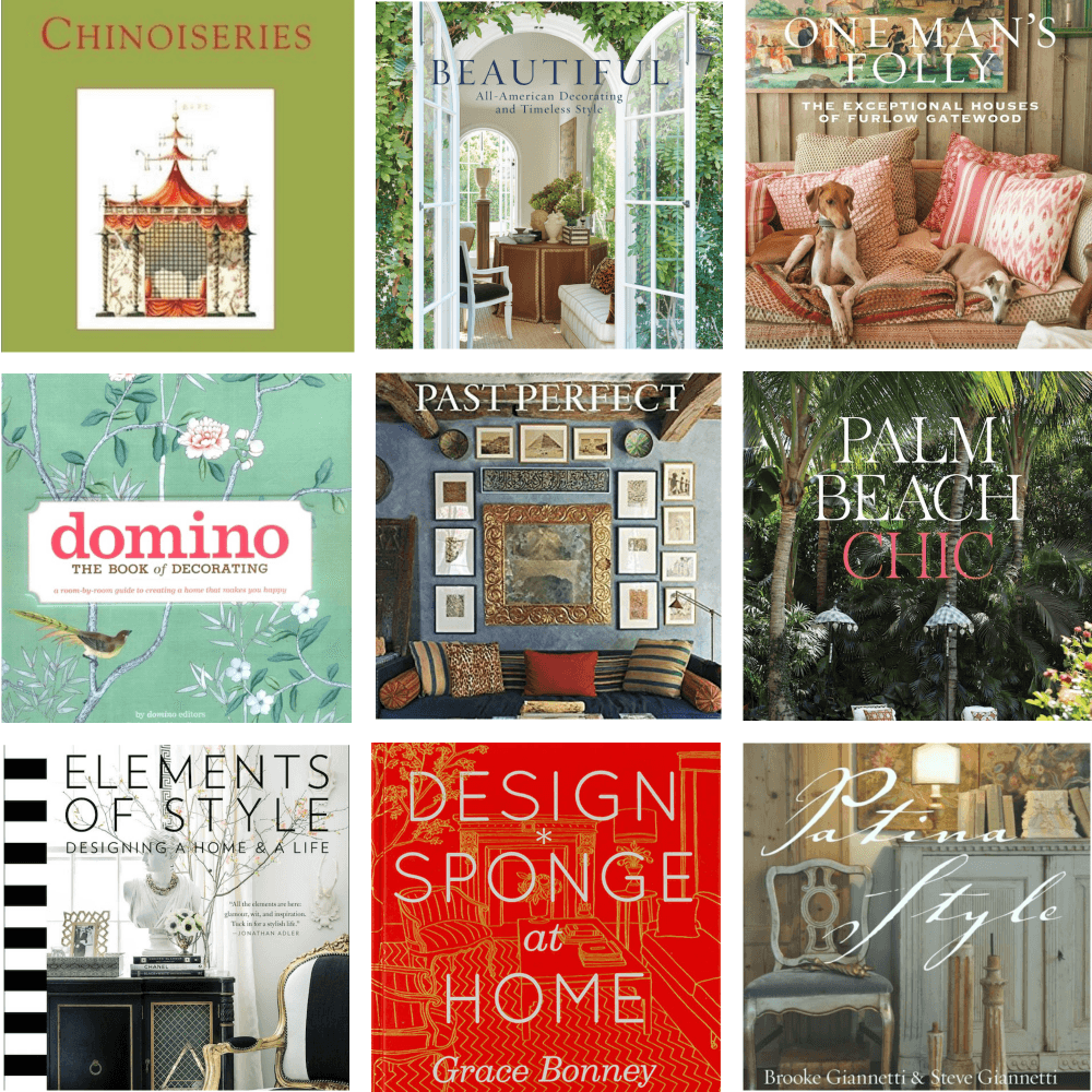
Related Posts
 The Kitchen Cabinets Arrived In a Rain Storm!
 Otis House-Surpising Lessons From A Late 18th C. Home
 40 Outdated Home Trends. But, Are They All Passé?
 My 20 All-Time Favorite Benjamin Moore Paint Colors
 Blah, Dated Condo – Is There Any Hope?
 The Interior Design Industry Could Be Dying – Here’s Why
 He Loves The Phony French Country Kitchens